Sunday, December 25, 2011

Majors and Minors - using it all up

I'm getting a head start on next Christmas while I'm still in the mood.  If you're a card-maker like me you know all about having a pile of scraps to deal with.  It's almost never that a single card idea uses up all the paper you've chosen.  The idea you have in your head becomes the Major. The challenge becomes how you adapt that idea to use up the scraps, creating the Minor. 

Here is a sample of one of my Majors and Minors.  It's a reoccurring theme for me.  There is a rendition of "T'was the Night Before Christmas" on my all time favorite Christmas album by Fred Waring and the Pennsylvanians that I hear in my head all season long.  Inevitably it results in the sugar plumb card. 

The larger one - the Major - was my original design idea, 5x7.  The background paper is from Pink Paislee's snow day collection.  I had been hanging onto a pack of felt snowflakes from American Crafts for forever and decided it was time to use them up.  I added glitter brads and stamped images along with punched out rings to create the 'visions of sugar plumbs that danced in their wee, little heads.'  The header image is from Unity Stamps - an image by Webster's Pages.  I may color it, but have plenty of time to decide.  Everything is embossed with clear powder to make the edges shine and the stamped images glossy.  It adds to the 'sugar' feel I was trying to create.  Some images are popped up with foam to add dimension. 

Since I used up all the glitter brads on the Major, I substituted crystal bling on the Minor.  The ribbon is American Crafts, again, and has the same color scheme as the background paper.  I reversed the paper for the Minor just to mix things up.  I think I'll get out my glitter glue and glitter up some of those dots in the background, just to keep the 'sugar' idea prevalent in both.  

Happy Christmas, Everyone! - AMK

Saturday, December 17, 2011

So the Wise Men don't get here until January, right?

Hand made Christmas cards. Let's face it, Christmas cards are a paper crafter's wet dream.  We love making them.  Look at me, it's after midnight and I'm blogging about making them.  Of course I should be ACTUALLY making them, but I tried and kept making a mess so I must be tired.

I need 47 in total to send.  So, yeah...I may have to invoke the "Wise Men" rule this year. 

As I recall my Catholic upbringing, the nuns made a big deal about the Wise Men finally showing up sometime in January.  I think it's the 6th?  The Feast of the Nativity, or Epiphany or some such thing as that?  Somebody help a bad Catholic out here on the date, please? 

At any rate, the "Wise Men" rule CLEARLY states that if you get your Christmas cards in the mail before they show up to the Nativity Party, you are not late.  Keep that in mind, y'all....

So far it's been a Crafty Brown Christmas here in the Burg. I cannot tell you exactly why I am digging this stuff, but I am.  I used to just have the plain stuff and that in itself was fun, but now they started printing on it.  How cool is that? 

The one with Prancer on it and his chorus line is a bit of a repeat of one I did for the store a couple years ago.  I never made it for Christmas delivery, just the store sample.  Same goes for the little white fox.  You can't outfox Santa!  Hah! 

The final one is also a remake of one I did even longer ago.  I like the idea of the calendar with the pin in it.  The pin is new to the design this go around (does it look like a push pin?), and I switched out the Santa image for one with more fur on his costume so I could use my liquid applique to puff it up.  That stuff is cool.  You need to get some.  

Oh - and how about those eyelets?  Come on, admit it.  You have THOUSANDS of those things and you quit using them because they fell out of vogue in the paper crafting world.  Well everything old is new again, apparently.  Get on board...

All cards are A2.  Any questions about any of the products used - shout them out.  Happy Christmas! - AMK


Thursday, December 15, 2011

The 2011 Cookie Book Reveal

Ta Da!  The annual cookie exchange took place last weekend and was yet another fun time with friends.  To all those of you brave enough to participate, THANK YOU! 

The book this year had a jacket that you slide off to reveal the embossed metal cover.  Then you open to reveal the pocket pages where the recipes are all tucked inside each pocket.  Page numbers and an index tells you who made what recipe.  Some books were red and some green, the letters and numbers and pages were all different for all the books so everyone gets something just a little bit unique.

Colleen took pictures, so shortly there will be photos to add to the book.  Because, what's a cookbook without pictures, right?  Happy Christmas everybody! - AMK


Thursday, November 24, 2011

Happy Thanksgiving!

There have been 6 piles of would be thanksgiving day cards on the floor for a while now.  Better late than never, right?  I caught a break this year and didn't have to do ANYTHING for the holiday. Not that I don't like doing the family thing with the big meal and all that, it's just nice to have this one all to myself.  Left to my own devices, I inevitably wind up covered with ink, glue and snippets of paper. 

I started playing with one of those Tim Holtz edge dies.  He comes out with a couple new ones every year.  This one makes the bracketed edge you see in all the samples below.  I started out kind of timid, not really getting into it, but each one seems to get a little bit more interesting as I added more and more edges. 

The other element on the cards is fringe.  Fringe.  Huh.  Kind-a cool, and Thanksgiving-y, right?  Traditionally, fringe is meant to help with water management, channeling it away from the body, hence you see all the biker/cowboy rain gear with fringe all over it.  The cowboys learned the trick from the American Indians who, as you know, played the starring role in the original Thanksgiving.  So, I say again, Thanksgiving-y, right? 

The fringe was cut using Cuttlebug's quilling dies.  You're supposed to cut this stuff and then roll it up on the tip of a quilling needle to make a flower.  To be sure, it makes a cool flower, but what's the fun in using the tools the way you're supposed to? 

Ok - how many of you bought that little 2x2 turkey die from Quikkutz when it came out 6 or 7 years ago?  C'mon, how many of you?  Hah! I knew it, no one but me owns this thing and now, don't you all wish you did! 

Happy Thanksgiving, everyone!

AMK


Saturday, November 5, 2011

Rejections

About a 6 weeks ago I put these together to submit to Card Maker magazine for the May/June issue next year.  I did not make the cut.  One of the requirements says you can't have submitted the work anywhere else, nor can you post it on your blog.  Since they rejected these, they are now fair game. 

The worst part about submitting is doing seasonal stuff out of season.  I find it really hard to get motivated for July 4th when it's September.  And, this particular magazine wants you using current papers and products.  Well, again, finding 4th of July stuff in the stores in September is not all that easy either.  Fortunately, We R Memory Keepers did this really cool 4th paper this past summer and I had some of that still in the arsenal.  The stamp set on that one is also WRMK.  The other one, I must confess was a valentine that I converted to the sweet 16 card.  They wanted special birthdays so that's what they got. 

Any questions on any of these, shout them out.  I would encourage you all to submit your work to magazines.  There are a host of them out there and it's a thrill to see your stuff in print.  Very few of them pay you in actual cash.  Many will extend your subscription for free or give you a free copy of the issue you are published in.  Card Maker is one of the few, if not the only one that WILL pay you in cash if you make the cut.  Don't be discouraged and don't edit yourself too much.  You'll be surprised at what some magazines will publish.  The stuff you thought was only marginal sometimes will surprise you. 


Sunday, October 23, 2011

Cookie Booking is Underway!

Hidey-ho, Readers!  Rest assured I've not forgotten about my little blog.  Now that the Halloween cards are all done, mailed even, I'm busy putting the finishing touches on this year's cookie book.  You'll have to wait to see the final results until after December 10th.  Half the fun of the cookie exchange is being surprised by the look of the book.  So no peeking.  Although,  I must admit, some people did get a sneak peak back in May this year. 

I usually start prototyping the design in Spring.  I carry it around with me for a while and let people beat it up a little just to make sure it's construction is sound.  It's a trick I've learned over the years.  That first book, six years ago, while cool and fun, is flimsy and prone to coming unstuck here and there.  As a result, I do repairs on the fly each year during the exchange.

I try to match the annual theme of the cookies to the book.  But again, that's something I learned after a few theme less exchanges.  The first real theme was 'Colorful Christmas Cookies'.  This came about after the previous year's cookies, although all tasty, were all different shades of brown.  I wanted to give away trays of colorful cookies, so that's why I picked that as our theme.  We had "Death by Chocolate Christmas Cookies", which were of course, back to a lot of shades of brown, but it was chocolate so who cares, right?  We did "Bite Sized Christmas Cookies" the year after the cookies were just too damn big.  This year I struggled mightily to come up with a theme.  Together with Colleen and Rosemary, I finally settled on Christmas Squared.  More on that after the exchange this year....

Here are some shots of the past cookie books.  You can see how the books get better constructed over time.

2006 was my first year at this and I must admit, it was a lot of work.  I designed a die for cutting the pages that Legacy was kind enough to have custom made.  In looking at the thing now, I can see where I could have engineered that better. 


Because 2006 was daunting, I opted to add pages to the 2006 book for 2007 and increase the size of the binding rings.  This was only marginally successful.


2008 is the colorful book.  Each page is an envelope where the recipe fits. 


2009 was bite sized.  The book was intended to be round like a cookie, but after playing with it, there was no doubt about it's ornament orientation.  So, despite there being a bite out of each page, as if the cookie was bitten, it still looks like I bit an ornament.  Oh well...


I should add that my cookie that year was a from a Halloween recipe, so I took liberties with my own page.  I've been trying to get the girls to 'bite' on a Halloween cookie exchange instead of Christmas, but it's been no deal so far....


2010, still trying to get that Halloween idea off the ground, Cheryl came up with Death by Chocolate and away we went.  Everyone got a little skeleton ornament and the papers were all very muted and dark.  Still Christmas, but darker than most.


Enjoy! - AMK

Thursday, October 13, 2011

Lest we forget the Christians...

If you've been following along, you are no doubt aware of all the Halloween excitement going on in the craft room.  Here are a couple of cards for those of you who, shall we say, delight not in the pagan celebration of All Hallows Eve?  To you, if you are there, I say you don't know what you're missing. 

How is it the Christians came up with All Saints Day on November 1st?  I'm betting it's because they laid a guilt trip a mile long on us fun-loving pagans, offering us a chance to repent from our 'devilry' on the VERY NEXT DAY.  Sneaky Christians, stop channeling my mother! 

Enjoy these - while not strictly Halloween, they are surely seasonal and therefore equally cool to use this time of year. 

Happy All Saints Day? - sorry - just sounds odd.  :) - AMK

This one's my Favorite of the bunch...

After I get all done with something like the Halloween cards, inevitably I have my favorites.  This year it's the one you see below.  There's two shots of the same card to illustrate something I do to keep things marginally unique.  They don't all have to be exactly the same, you know.  Experimenting is good!  (sorry about the color on the second one - it kind of washed out, but you get the idea)

There is something about that Giant Eyeball from Inkadinkado that just makes me laugh.  It is definitely a keeper.  I already have another idea on how to use it in my head.  Not sure if I should wait till next year or just make it now.  Hmmmm...

I pared the eyeball with paper from Reminisce (Halloween Night) and Basic Grey (Erie collection - Tombstone).  And, yes, there's another one of those Christmas stamps that just works perfectly for Halloween as well.  Anybody out there own their own copy of the Nightmare Before Christmas?  That's the first time I realized how alike the two holidays really are.  Tim Burton is genius. 

To get the shine you simply emboss the eyeball with clear embossing powder after stamping with black pigment ink.  The shine on the background swirl is Ranger glossy accents, again.  I do like that stuff.  I used it on the eyes of the jack-o-lanterns in the background and on some of the dots as well, just to add a little interest and keep the eye moving. 

Happy Halloween everyone!  Enjoy - AMK


Sunday, October 9, 2011

Wash Me and Put Me Away!

Here's another of my tips on organization.  I've just about come to my wit's end with Halloween cards and the aftermath is all over the craft room.  One of the things I do so that I don't lose track of all the stamps and their packaging is designate this cardboard bin as the "Wash Me" bin.  I've never been one to do things until they reach critical mass, so this suits me well.  When the bin is full I bring it downstairs to the kitchen.  All the acrylic blocks go into the dishwasher.  All the cling stamps get dropped into a warm sudsy bath and then laid out on a cooling rack until dry.  Galvanized rubber gets a wash using my trusty Stampin' Up! scrubbing pad.  When it's all clean, they all go back into their packaging and back into their drawers upstairs.

Similarly, I don't like to put my new stuff away right away.  When I bought it, I had an idea in my head.  If I put it away too soon, then I forget.  Therefore, the "Put Me Away" bin was born.  Also - I have developed a die cut library - an index of all the dies I own.  As they come in, they sit in the bin until they get added to the index.  The index keeps me from buying things twice.  The index is also a huge pain in the ass to keep updated, but it serves a purpose, so I do it.

Tuesday, October 4, 2011

Unlucky 13 - Unity Stamps

I was trying to convey the concept of a creepy garden gate or front door with this card.  Something that brave trick-or-treaters would dare each other to walk through.  The center image is reminiscent of the door knob or perhaps the knocker.  I couldn't decide which way to orient this card and finally settled on what you see here.  It could work just as well as a flip top (although the bats on the Martha Steward punch would be upside down).  The second image shows the shine on the 'ironworks' inherent in using the glossy black card stock.  Click to embiggen. 


Here are the tools you'll need to recreate this card. 

Unity Stamp set - Unlucky 13
Hero Arts Stamp - K5347 Misty Swirl Long
Quickutz Revolution die - REV - 0039
EK Success Whale of a Punch - Circle punch (1.75")
Martha Stewart Halloween Fence punch (not pictured)
Spellbinders Nesting Circle die - 2"
Cuttlebug Embossing Folder - Swirls
Maya Road - decorative Pins
Making Memories - Spellbound two sided paper
Black glossy card stock
Orange card stock - middle hue, not too bright, not too pale.
White card stock scraps
Colorbox Chalk Ink - Tangerine (not pictured)
Colorbox Pigment Ink - Sepia Black (not pictured)
Ranger Embossing Powder - Clear (not pictured)
Small rubber brayer and pallet board.


The recipe is as follows:

Stamp unlucky 13 and Trick or Treat using Sepia Black onto white card stock.  Emboss the round image with clear embossing powder and punch out using the 1.75" punch.  Trim the paper close to the Trick or Treat words and ink edges of both pieces with Tangerine.  Ink the edge of the words a second time with Sepia black, leaving some of the tangerine to show through.

Die cut an orange 2" circle.  Place it inside the embossing folder and roll it through.  Using the brayer loaded with Sepia black, ink the embossed circle to show off the design.  Ink the edge with sepia as well.

Using hot glue - put a blob in the center of the orange circle.  Arrange two of the pins in the glue and layer Unlucky 13 image over the pins, centering it within the orange circle.

Cut the Spellbound paper to 12 x 5 and fold it to 5 x 7.  The front of the card will be shorter than the back. 

Stamp the misty swirl image onto orange card stock with Sepia Black ink.  Trim right up to the image, ink the edge with sepia and mount to white card stock.  Trim the white to be 5" long and adhere to the inside back of the card.  You should see it when the card is closed. 

Cut two of the hinges from the Quickuts die using glossy black and adhere to front of card as shown.  Using glossy black, punch a longer strip than you need of the fencing so you can lay it on the front of the card without having to trim a fence post in half the long way.  Way to difficult and in the end that fence post will be too delicate.  Adhere to front of card as shown and then trim to fit.

Place adhesive on only one half of the back of your Unlucky 13 image.  You don't want this to stick to the inside of the card through the fencing.   Adhere to the front of the card as shown.  Layer the words behind the pins, and adhere.  Again, watch where you put the adhesive so you don't stick the card closed.

Hope this makes sense, shout it out if it does not.

Enjoy - AMK

Sunday, October 2, 2011

Embrace the Voices In your Head

People always ask me how I come up with all these ideas.  All I can say is I've made friends with the voices in my head.  Yeah, it sounds a bit like I've been cuttin' the Prozac in half against Dr's orders, but I don't know how else to say it.  That thing that twangs inside our brains when we come upon something that makes us happy is what I listen for.  When I hear it, I pay attention. 

I wander the world of paper crafting waiting to hear something speak to me.  I don't know what I'll do with a certain thing when I come across it, it just speaks to me so I add it to my collection knowing that some day, it will become part of a larger thing, that has a voice all it's own.  There are ideas in my head all the time.  When they get too loud, I HAVE to get them out. 

I'm continuing to plow though those piles of organized Halloween chaos I showed you in an earlier post. Here are four more samples that have made it from pile to produced. There is one more in play at the moment and I think 6 or 7 more piles left up there. 

These are two that illustrate a similar theme.  I really wanted to get the haunted house in there among the spooky trees, but the proportions were all wrong.  Separating them worked out pretty cool too. 

That's a Spellbinders nesting die circle that I ran through the Cuttlebug spider web embossing folder and then inked with some lime green pastel chalk ink.  The trees are a Quickutz die (now known as LifeStyle Crafts).  The haunted house is part of a stamp set from Close to My Heart that I colored with Prisma Color markers.  I was able to do one of my favorite things, re-purpose a stamp meant for, in this case Christmas, as a Halloween stamp. "not a creature was stirring" works well for Halloween, don't you think?  I accented the eyes in the trees and the windows on the house with some Ranger Glossy Accents.  If you have not tried that stuff yet, get some.  It's a great way to add shine without curling the paper, and it dries relatively fast. 


These two are my obligatory attempts at Halloween romance.  One is quite dark, and one is perky.  Guess which one I like better?...Gah!  Although the darker one does not really say much, if there's ribbon on it, then it's romantic as far as I'm concerned.  The perky one has bats and a big purple heart cut from Sizzix Original and Bigz dies.  The sentiment on the perky one was done on my computer last year.  Yes, this is one that stayed as a pile in a box for a full year because I didn't get to it last year. 


If you have any questions about any of the products used or techniques, shout them out.  I have all the details, but sometimes spelling it all out can get a little boring for you to read.  If you want any of these as a full blown class, or even a mini class - I can do that too.  Shout out, is all you need do. 

I know the comments section on the blog has a mind of its own.  But Anonymous works well.  If you use Name/URL, that works well to.  You can use your FB page for your URL if you aren't nutty enough to have your own blog.  

Enjoy! - AMK

Saturday, October 1, 2011

Hello World!

A couple of years ago PaperCrafts magazine declared October 1st as World Card Making Day.  OK.  I suppose it's not any different than some of those holidays that Hallmark has made up over the years.  At least with this one we get to be a little creative.  Make someone a home-made card today! 

Here's one of mine and it'a all for you!

Enjoy - AMK

Tuesday, September 27, 2011

The Halloween 4-Square - This one's for Barb Housner

Barb left a comment on the Cool Cat Card Class post and as promised, I made this one for her!  Thanks for your support!

Ahhh, the four-square.  A timeless card design I use again and again.  I don't think there's been a major holiday in the last 10 years that has not seen me use this design in one way or another.  And, if you ever wondered what people see in those Inchie stamps from Inkadinkado, well here you go.  I own no less than 13 sets and I believe there is one on the way. 

If you decide to dive into the Inchie scene, do yourself a solid and buy the 1", 1.25" and 1.5" square punches from EKSuccess.  You'll get nice even tiles with no measuring and a perfect .25" or .5" matt with just a squeeze.  How cool is that? 

I hung these little guys on a big, full, yellow moon made from Spellbinder's nesting circles set.  They are matted with orange and black glitter paper.  A 'Happy Halloween' puctuated with sparkly brads by We R Memory Keepers and a sprinkling of sequins finishes this one off.

Enjoy! - AMK

Stamping and Scrapping Sites - Links and Reviews


Hi All - below is a table of my go-to online shopping sites when I need something or just need a fix.  There are a plethora of other sites out there, but these are ones I frequent the most.  I've 'Friended' some of them on FB and to do so means you get project updates as well as sales updates.  I have no really good reason why I have not 'Friended' them all except that I am lazy.  It could be they are not on FB, but that would be hard to imagine.  These are in no particular order. 

I would love to hear if you have a favorite site.  Leave a comment to share the link. 

Enjoy! - AMK


Site NamePricingSelectionEase of UseBest ThingWorst Thing
ScrapyLand.comAlways DiscountedExtensiveThe site is ok - but the search feature could be enhanced. New products are available for pre-order at a discount!  Sign up to get coupons and sales notifications sent to you.  This sight sells items that are normally only available from European Sites.  The site name is spelled wrong on purpose.  Don't be fooled if you type in Scrappyland.com (w/ 2 p's).  
StampyLand.comAlways DiscountedJust Ok but growing every day. The site is ok - but the search feature could be enhanced. Free Shipping all the timeYour ScrapyLand account does not work here.  You have to sign up again. 
OhMyCrafts.comAlways a CouponExtensive - but popular items are out of stock fast.This site needs an update.  Clunky, but usable. Sign up and get emails with discount coupons almost every day. Clunky navigation of the site. 
Micheals.comVariable based on SalesLimitedGoodYour repeat buy stuff is usually available when you need it. They only add new products 2-3 times a year.  
Joann.comVariable based on SalesLimitedGoodSign up and get emails with discount coupons.  The online only deals are usally hard to pass up.They are not as bad as Michaels with adding new products, but they are still slow compared to the other stores. 
AddictedtoRubber
Stamps.com
Usually full priceLimited but they say they are growingVery Good - the standard by which all others are measured. This is a new owner for an old stand by site.  If they get their inventory back to where the original addicted was, this will be the place to find any stamp you may need. The new owners did not retain your previous account status. 
Scrapbooking.comVariable based on SalesExtensiveVery Good - the standard by which all others are measured.  Selection is HUGE here.  New stuff is coming in every day and available fast.  Sales are usually generous.Not a lot of email coming out of this site to let you know about the sales.  You'll have to visit often to see what's happening. 

Sunday, September 25, 2011

Coolest of Cats Card Class - Mini

In response to Andrea who lamented not having any of the products from the previous card class, I created this card with an eye for easy substitution.  It's a mini class, which is my way of saying the construction of the thing is pretty straight-forward. 

Hey - how about this?  If you send me a pic of your version of this card, I'll post it here for everyone to see.   amking1964@gmail.com will get it to me.  It will be fun to see your interpretation of it. 

First - here is a picture of the supplies I used: 

Background paper - Reminisce, Midnight Stripe (I bet the designer has a cat named Midnight)
Cat Stamps - These are two images from a company called Prickly Pear.  I picked up these little guys at the One of a Kind Rubber Stamp and Scrapbook show in Madison last year.  The Saturday before Thanksgiving, folks.  Mark your calendars.
Circles Stamp - that's Tim Holtz, he's got an embossing folder that matches it if you really dig it.  
Embossing Powder - ZING by American Crafts - Orange, this stuff is glittered. (Andrea's favorite medium)
Staz-On - Jet Black
Sentiment - sorry - the manufacturer is not labeled on this one, it's really easy to use your printer though, (wink, wink!)
Orange Brads - these two here are swirl brads in two colors of orange.  They came in a glass tube that was prone to rolling off the table and breaking on the floor, hence I don't have the original packaging to tell you who made them. 


The finished card is #10, that's 4x9.25.  It will fit nicely into a #10 business envelope.  Take your supplies and work your magic and make them look like what you see below.  Note that I stamped two sets of circles, embossed them and then cut them out.  Stamp everything on the scraps from your cream colored card stock. 


When you're all done putting it together, it should look something like this.   That's it.  Like I said, a mini card class. 

Let me know what you think and send me your versions!   Enjoy - AMK

Zutter Kutter - Part 2, a review


A couple of days ago I blogged about a new (to me) tool called the Zutter Kutter.  This thing retails for $169.00 but I found a used one on Amazon and decided to take a chance.  It arrived super-fast and in its original packaging.  The first owner indicated she only used it once.  Yeah!  But of course that makes me wonder why only once....hmmmm. 

Things to consider if you are thinking about purchasing this tool:
  1. It's heavy.  But it needs to be to do the heavy lifting of cutting board stock.  It's not as heavy as the Big Shot Pro, if that's a reference for you.
  2. It's about 15" long so you will need some space when you want to use it.  Not too surprising.  Board stock is larger than 12x12 most of the time so you'll need some space to swing that stuff around anyway. 
  3. Because board stock is larger than 12x12 you'll have to cut it down the old fashioned way before it will fit in this tool.  Not terrible and is what I expected. 
  4. I did some test cuts with some scraps of chip board and was not happy.  It went just shy of cutting through the whole thing.  I kept having to turn the piece over to get it to cut all the way through.  Odd.  And, definitely a drawback.  But then I remembered the original owner and her 'only one use of the thing'.  I pulled out the blade and found it was notched.  Bingo!  It was a simple thing to reverse the blade and begin cutting again.  Can you say "hot knife through butter"?
  5. To look at the thing - that large black knob looks like it's integral to the function of cutting.  It's not.  It's just a handle for you to hang on to with your free hand to keep it out of the way. 
  6. Safety is well thought out.  You can't even see the blade much less get yourself in the way of it.  I did, however, come close to bloody-ing myself when reversing the blade, but I admit, I'm a spaz.
  7. Blades are reversible (obvious by now) and cheap.  Between $5 and $6.
  8. It does not come with instructions.  You might think, that because mine was used, the original owner just forgot to include them.  But, no.  After a little Internet research, most of the people who reviewed this thing at their purchase site said it was a pain to have to download the instructions.  It was not a pain, just inconvenient. 
  9. It's not meant for cutting just one sheet of paper.  You can stack about 20 sheets, clamp them in and cut, but the heavy duty blade does not work well on just one sheet.  They tell you this in the instructions....that you have to download.  :o/   So - if you were planning to replace your every day cutter with this, that's a no.
  10. The measuring stay is only six inches long.  That's way too short in my book, but it is able to be used on either side of the machine.  It will be easy enough to create a jig for larger cuts when the time comes.  Maybe the company will read my review and create one for us!?
Overall, on the scale of 1-10, I'd give this thing a solid 8.  It will make my book making a LOT easier.

Regards, - AMK

Saturday, September 24, 2011

Halloween Card Class - a rainy afternoon project

It's Saturday here in Cedarburg and man, is it raining.  Dennis Diebold must have washed is wife Lynn's car again...He tells me that's the surest way to make it rain.   To while away the afternoon I put this little card together.  It's one of those piles you saw on the floor in a previous Halloween post.  Hopefully the pictures will make things clear. 


First - we have to give credit where credit is due:  Here are the tools you'll need: 

Sizzix Strip Die - Bats;
EK Success punch - Drops;
Sizzix Tim Holtz Alterations embossing folder - Halloween Words;
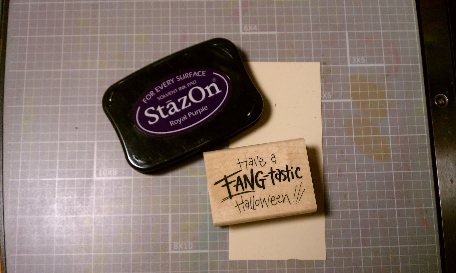
Stampendous H258 - Fang-tastic
Staz-On - Royal Purple
Versa Mark - Grape (not pictured)
Colorbox Re-Inker - Lava Black (not pictured)
Small rubber brayer
Pallet board
Background paper is from Cosmo Crickit, Haunted collection - Macabre
Transparency Film
White, beige, orange, purple, black card stock scraps
Die Cutting Machine - I use the Big Shot.  It's my workhorse. 


The finished card is A7 - that's 5x7.   The embossing folder is A2 - that's 4.25 x 5.5.  So trim your papers accordingly. 

Ok - Let's get started.  If you click on the finished card to embiggen it, you will see the transparency overlay over the words.  This adds to the interest of the card and makes people say - 'How'd you do that?'

Well - here's how:

Cut your transparency film to fit the folder.  There are two definate sides to this stuff.  The rough side is meant to take the ink.  So always use that side down. 


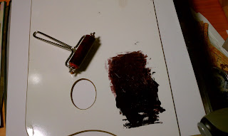
Dribble a little Lava Black ink onto a pallet board and roll it around with the brayer until you get a nice even smudge. 


Open the embossing folder and roll the ink onto the back panel with the brayer.  Don't think to much about this or you will go crazy.  You are working with a transparency and that means everything is in reverse.  Lay the film inside the folder with the rough side down and roll it through your die cutting machine.


Next, cut a piece of white card stock the same size as the transparency, lay it into the emobssing folder and run it through.  Don't worry about cleaning the folder.  The ink, remember, will be on the back side of the white card stock, so you won't see it. 

Load the brayer with ink again, and roll it onto the front of the white embossed card. 


Layer the transparency over the card stock and attach using a few strategically placed mini-glue dots. 


Ink the stamp with royal purple and stamp onto beige card stock scrap, trim close to image, edge with grape ink, and matt with first orange and then purple.  Don't use white for this image.  You want those fangs to pop, so they should be the only white element to the card. 


Ok - if your hands are not clean, go wash them.  We want these fangs to be a nice bright white.  I had to toss my first set because my fingers were full of ink.   Punch out two sets of the fangs using the Drops punch.  Make sure your paper does not have an obvious texture as that's usually only on one side.  You'll be turning one of the sets over to get the shapes you need for this. 


Die cut one of the smaller bats from the strip die using a black scrap.   Now you have all your pieces, so let's assemble the card. 

I liked the background paper so wanted to show more of it rather than less.  Attach the embossed panel to the card as shown and trim off the pieces that don't fit on the front.   Layer on the stamped image.  Pop up the fangs and the bat with some foam squares.  Ink the outer edge of the card with grape ink.  Stay away from the transparency with the grape.  The front of the transparency will not take the ink and you'll just get it all over your fingers.  If you want to add a purple edge to the transparency, you'll have to do it with the Staz-On. 


That's It!  Hope this was all clear.  If you get confused, post a commnt.  I'll respond in kind. 

Enjoy! - AMK